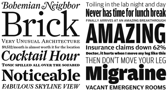
Farnham. 2004, Font Bureau; Amplitude. 2001–2003, Font Bureau.
How do you, as a contemporary type designer, work within the constraints and historical context of book/text type design?
I got into type design because I love to read—magazines and newspapers as well as books. This probably explains why my taste in type skews a little conservative and explains my love of historical typefaces. Although these three kinds of media are all printed on paper, the text type for each has pretty different needs. Newspapers are usually printed in narrow columns with very little leading, while book type is typically in wide columns with generous leading, on much nicer paper, and so on. I’ve enjoyed working within and pushing against these constraints, and there’s much more to explore.
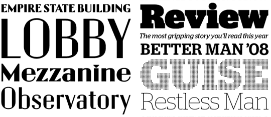
Empire State Building. 2007 (Designed with Paul Barnes); Stag and Stag Bold Dot. 2005–2008.
What is the most crucial step in the development of a typeface?
For me, deciding on or understanding a typeface’s purpose is the most crucial step. The typefaces for the Empire State Building referenced the building’s existing lettering but also had to be legible for signage, while taking into account materials and manufacturing processes. I like working with these kinds of constraints, because they usually force me to be clever and use some lateral thinking. For self-initiated projects like Amplitude and Farnham, I’ve come up with strict guidelines for myself, because having a problem to solve keeps me focused. Out in the wild, designers will use a typeface in unexpected ways, but it must do one thing really well before it can do other random things well.
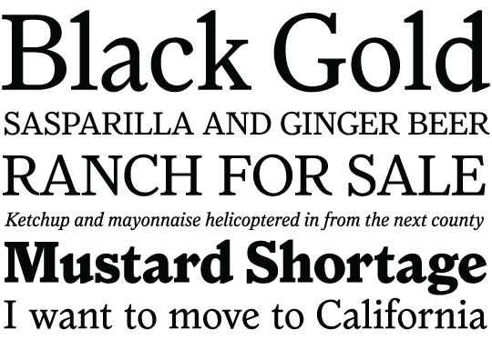
Houston. 2003.
How does your type design process start?
Before I start drawing something I spend a lot of time ruminating on ideas and discussing things with my frequent collaborator, Paul Barnes. I also like to look at historical examples of how problems have been solved before—I may not follow what my predecessors did, but then at least I know what I’m disagreeing with and why.
In your opinion, what makes a good typeface?
A good typeface is well crafted and useful, and sets up into attractive-looking words. It also holds together as a complete system, where individual letters don’t distract the reader. A good typeface doesn’t make you wonder what you might do with it, or why it exists.
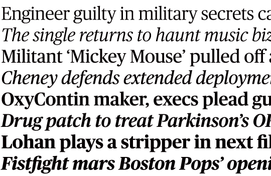
Publico. 2007 (Initial version designed with Paul Barnes).
What is the most important advice you received when you first began designing type?
Tobias Frere-Jones told me to always space as I draw, which is obvious once you know it, but was a revelation at the time. Matthew Carter told me that I didn’t need to learn calligraphy to be a good type designer, unless I wanted to. That opened up my eyes to the fact that there are many different, legitimate ways to create good typefaces.
For more work from Christian Schwartz, visit www.christianschwartz.com


