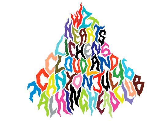
Wzt Hearts. Color photocopied flyer, 2007.
You have a fine arts background. How did you get into lettering, which is often considered the realm of graphic design?
I first began making posters out of necessity, for my bands in Baltimore. You’ve got a show, you need to promote it, and you want to make the poster look nice. Eventually other people began asking me to do flyers. I don’t think I would have started making posters, especially for other people, without that aspect of self-promotion of the music I was playing.
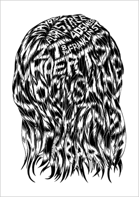
Sightings. Photocopied flyer, 2005.
What, if any, distinction do you see between making a text-based poster and creating a drawing or art installation?
Both my posters and my artwork usually start with a simple material base and have a lo-fi, handmade process. With posters you have a single pen or a box of markers. I like taking a simple object or set of materials and turning it into something visually complex. I really appreciate bold simplicity, but I’m not a great “simple” designer. My work often winds up being ornate and taking a long time. It isn’t necessarily ornate for its own sake but about whether or not I think it’s worth putting the time into.
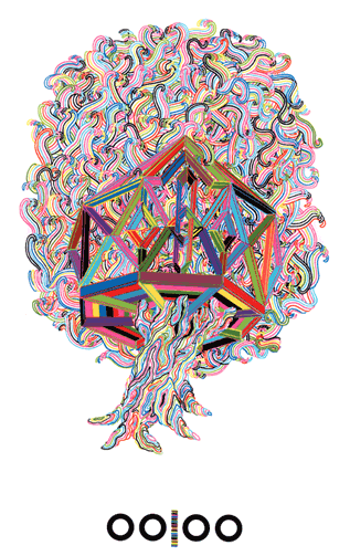
OOIOO. Screen-printed poster, 2007.
Why do you take a primarily hand-drawn approach to your flyers and posters?
I never had a computer or took any computer courses in college. I really eschewed the graphic arts industry when I was in school. It wasn’t something I considered having to use because, of course, I was going to be a “famous artist in New York.” It became quickly apparent after I started making posters that the hand-drawn aspect was a big part of my interest. Handmade stuff is more interesting to me; your style emerges more quickly.
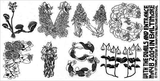
Lungfish. Photocopied flyer, 2004.
Your work often combines lettering and image into a single composition. Why do you approach posters in this unified way?
I like integrating lettering into the imagery of the poster so that it really feels like one whole thing, not just some drawing from a sketchbook with words across the bottom. It makes an event seem more important when there’s an image that can’t be detached from the show. Sometimes I’ll focus my energy on the information, the letters rather than the image—making the letters into the image themselves. It’s pretty infinite what you can do to letters, and it’s amazing what your brain will read. Anything can be very simply turned into some kind of letterform. There’s really no reason or need to have anything else on a poster other than cool letters. If the poster is striking enough, whatever the degree of legibility, people will spend a little more time with it.
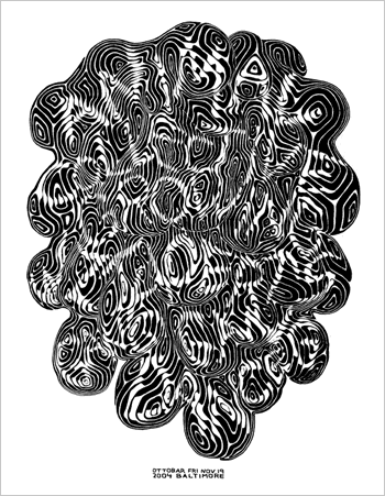
Animal Collective. Photocopied flyer, 2004.


